It’s Good To Be Wrong
Monday, April 4th, 2011
My wife and I share an addiction. It hinders us on evenings and consumes us when we travel. The need to buy more is always there. Sure the costs seem minimal at first, but the more we buy the more they add up. We are not addicted to heroin or meth, its worse: We both love magazines and we each have our favorites. She’s a Cosmo, Glamour, Vogue kind of gal, while I’m a National Geographic, Fader, and Wired sort of guy. Together we adore the slick covers, plethora of interesting articles and images, the random bits of knowledge we gain from incessantly paging through each feature as the reorder cards fall into the aisles on planes or stick to wet train floors.
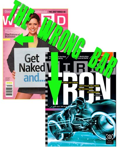
 I bring this print medium up because recently I pulled a lesson from one of those magazines. Wired has been placing an odd ribbon of color on the cover of its publication for about a year now. They have labeled it the “Wrong Bar.” Wired pulls this design inspiration from something known in design as “wrong theory,” which is basically the idea that when you make a perfect design and then make one thing look wrong, you attract attention. By adding a color that is clearly in contrast you create tension, but also draw the eye.
I’ve been interested in this wrong theory for a while and have started to apply it to e-mail index pages – specifically to the area I want someone to take an action. The sample campaign below was for our ASI Virtual Trade Show and the e-mail was to gain attendees. The campaign features a color scheme of grays and green. The “wrong” color orange was added as opposite color to gain attention instead of another complementary green that would blend into the color scheme of the design. Try wrong theory on Web pages, e-mails, videos, flash demos, print ads, posters, or really anywhere you may want to attract attention.
Tags: Email Marketing, Jake krolick, Online marketing, Virally Yours, Virtually Yours, Wrong Theory | Posted in Uncategorized | 49 Comments »
