Posts Tagged ‘Virally Yours’

What Not To Do At a Trade Show (or Why To Exhibit At a Virtual Show)

Friday, June 17th, 2011
Let me preface this post by saying I read an article in an old issue of GQ that listed some things never to do with an expense report so I asked some of my wild buddies for their suggestions and they came up with some doozies.   So I am passing these lists to you because it seems like a great opportunity to list reasons why a Virtual Trade show is cool.

First up 10 Things not to do with an expense report (or reasons why to try a Virtual Trade Show)

10. Never turn in anything that say’s Tiki, Hookah, or Drunken Monkey

9. Never play credit card roulette with a corporate card

8. Never expense beer pong, limos, or “prescription’ meds

7. Your spa day is also not expansible

6. Neither are your shoes

5. Never let your customer pick his “favorite” bottle of vino

4. No political donations to the prime minister of Canada

3. Corporate cards are not for buying the bar a round

2. I know you were thirsty but the $30 bottle of water in your room is not to be expensed

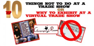
1. No corporate cards in the champagne room

I know none of you have had these situations in your life, but if you have, then consider a virtual trade show.  With the expense of attending a real trade show looming over your head and technologies quick evolution, the virtual trade show has become a wonderful and affordable resource.  Here are 10 reasons to exhibit and attend a virtual trade show.

10. These virtual events can be designed to look like a convention center, your favorite city, or anything you can imagine.

9.  As for booth placement, you’ll drive more attendees if you pay for prime real estate in the virtual exhibit hall, but the traffic these show can generate is in the high hundreds to thousands.

8. The savings is amazing – just think how much $$$$ it would take to send your entire sales and marketing team to Orlando or Vegas.  Now every person in your company can visit a virtual trade show for free.

7.  When you host a Virtual trade show booth both email and contact info is a breeze to capture making follow-up on those leads a cake walk.

6.   Education is usually available on demand so you can share it with people who did not attend and learn at your convenience.

5. Because your booth is online so are the people visiting.  Showcase your business and products with video, links to your website, product catalogs, instant chatting, VOIP, Skype.  Use really anything that is available online.

4. Networking is actually quite easy – think of the Virtual Trade Show as just another Social Media where you have multiple ways of sharing interests, ideas, likes and heck most Virtual Trade Shows connect to Facebook, Twitter, and Linked In.

3.  Talk about affordable- The Virtual Trade Show average for a booth is around three thousand dollars.  Depending on the show if there is an average of 15 trade show booths and an average of 1500 attendees, each booth gets an average of nine hundred visitors.  You’re paying roughly three dollars per qualified lead.

2. Since you attend from your desk and computer you can multitask and still go to meetings, take phone calls and be able to get the kids at soccer practice after work and sleep at home in your own bed.

1. Did I mention the savings?  Not only financial savings, but the time you save is incredible.  I don’t know about you but, I really dislike my experiences in airports.  Food for thought…

Tags: , , , , , | Posted in Uncategorized | 41 Comments »

It’s Good To Be Wrong

Monday, April 4th, 2011

My wife and I share an addiction. It hinders us on evenings and consumes us when we travel. The need to buy more is always there. Sure the costs seem minimal at first, but the more we buy the more they add up. We are not addicted to heroin or meth, its worse: We both love magazines and we each have our favorites. She’s a Cosmo, Glamour, Vogue kind of gal, while I’m a National Geographic, Fader, and Wired sort of guy. Together we adore the slick covers, plethora of interesting articles and images, the random bits of knowledge we gain from incessantly paging through each feature as the reorder cards fall into the aisles on planes or stick to wet train floors.

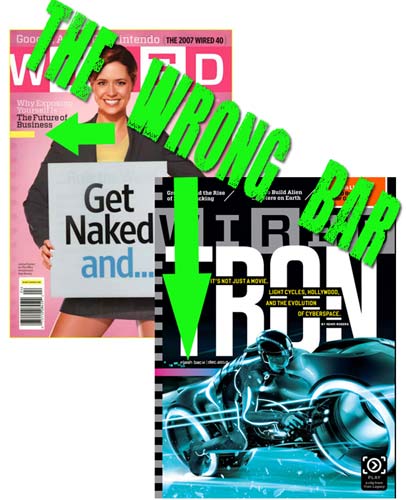
I bring this print medium up because recently I pulled a lesson from one of those magazines. Wired has been placing an odd ribbon of color on the cover of its publication for about a year now. They have labeled it the “Wrong Bar.” Wired pulls this design inspiration from something known in design as “wrong theory,” which is basically the idea that when you make a perfect design and then make one thing look wrong, you attract attention. By adding a color that is clearly in contrast you create tension, but also draw the eye.

I’ve been interested in this wrong theory for a while and have started to apply it to e-mail index pages – specifically to the area I want someone to take an action. The sample campaign below was for our ASI Virtual Trade Show and the e-mail was to gain attendees. The campaign features a color scheme of grays and green. The “wrong” color orange was added as opposite color to gain attention instead of another complementary green that would blend into the color scheme of the design. Try wrong theory on Web pages, e-mails, videos, flash demos, print ads, posters, or really anywhere you may want to attract attention.

Tags: , , , , , | Posted in Uncategorized | 49 Comments »

Make a “Cool” Company Video

Monday, March 28th, 2011

I consider myself late to the game when it comes to YouTube. I uploaded my first video in 2006, a year after the site was rocking. I got heavily involved in making short videos by 2007. In my eye that was about two years too late to really claim that I was maven, first to plant my flag on the behemoth that is YouTube. To make up for that fact, I decided I was never going to post unedited videos. Instead I would do what so many others have failed to do, which is edit my videos. A little editing goes a long way and separates your video from the clutter.

Anyway, the point of this post is to stress the importance of making interesting videos for your company and products. It’s now almost as important to be able to create and edit videos for and about your company as it is to have a company website. This is especially true if you have products that you sell, and it is that much more important if your products are unique.  The key to making your company video cool is to be inspired and then to execute your plan showcasing your creative inspiration.  I can’t begin to tell you how many company/corporate videos fall short here.  They become a generic look at a unique work place.  Simple fact – if you’re not passionate and inspired by what you create it will be painfully obvious.  

A few rules of thumb – keep it quick, if you are going to make me watch something for several minutes make sure you hold my interest.    Create several and test them with your staff, family and friends before placing them on your website.   Hire college students to help especially if you have a local university that has a film department.  They need the experience and will bring the know-how to the table for less $.   Edit your footage.  If you don’t have the time to learn a basic editing program like Apple’s IMovie or Window’s Movie maker – (both are as easy to use as PowerPoint) – hire a student in your community to help. 

Here are several company/product video ideas to inspire your inner Spielberg – or for those who enjoy more explosions, your inner Jerry Bruckheimer.

Make a video about the history of your company. Be classy and passionate by conducting a serious interview. Then mix it up with some old photos, cool shots of your products with lots of depth of field, and a killer soundtrack. Yours could be just like Oakley

Make a humorous video showing how you test products and make sure the president of your company is placing his body in harm’s way.  Yours could be similar to Brand Fuel Or like the work from Jeff Anderton for Geiger

Tags: , , , , , , , | Posted in Uncategorized | 76 Comments »

Tidbits from SXSW 2011

Monday, March 21st, 2011

SXSW was held March 11-20 and for those who don’t follow this all out music, film and interactive blitz in Austin Texas, you’re missing out.  Here are a few bits from Austin that caught my eye and ear.

This year’s interactive awards recognized some well deserving winners.  Let’s start with Chris Milk.  His name may not set off sirens in your head, but it should.   This music video director and photographer has made some hefty contributions to the interactive world over the past year and is connected to two extremely interesting projects one with The Arcade Fire called the wilderness downtown.  This interactive, data-driven, Chrome Experiment uses HTML5, video, audio, and canvas.  It made several waves across the social universe about 8 months ago and won an award in the music category.  Milk also built the winner in the art category that you can visit here.   Milk is a talent to watch in the upcoming years and his vision will help redefine the interweb.

Another stand out piece of design and interactivity was in the motion graphics category.   It is not so much that I enjoy this game or its functionality, but I adore the fantastically creative concept.  Much applause for the Bell Brothers who created a cleaver mash-up of hip music, some simple DJ skills and children’s stories in this must see visual experience.

The Breakout Digital Trend winner seems to be an interesting time saver, but since I haven’t had a work trip or night out with a substantial crew since I downloaded it, I can’t say I’ve thoroughly road tested this app.  GroupMe is a free service that allows group texting, or SMS, and allows users to maintain relationships in clusters as well as one-to-one communications.  Basically you can easily broadcast text messages to your group to make plans for dinner or to meet up at a bar.  You can create these groups easily and then go dark (meaning you should not be contacted) or simply delete the group when you are done with the evening out, work trip, or vacation.

P.S.  Besides Jack White’s  bus stunt, I couldn’t let an opportunity slip by to recommend some of the new music coming out of 2011 SXSW so here are four picks from this year that you should check-out ASAP.

Guadalupe Plata – Guadalupe Plata – Serpiente Negra

Ages and Ages  

The Joy Formidable

Yellow Ostrich

Tags: , , , , | Posted in Uncategorized | 182 Comments »

Naming Your Blog –aka- Hassle City

Wednesday, March 16th, 2011

So you may wonder why the header has the original name of this blog ‘Virally Yours’ crossed out and the new name ‘Virtually Yours’ written in.  It’s kind of a funny story with a lesson embed in there somewhere.

Who knew naming a blog would be such a hassle?  Honestly it took about 10 minutes to come up with the original name of this blog.   I figured I was in the clear until the web team sent me a friendly email that went something like this,

“So we’re setting up your blog and the domain was blocked by our company internally.  That’s not a huge issue, but if our software blocks the name, it’s likely others may as well…”

So basically my ploy to be fun had been shot down by our company’s web protection plan.  You know the stuff that blocks all those naughty bits from popping up, the porn, the foul language, the sleaze and the web junk that your company has determined is best left at home.  Unfortunately my clever name was also blocked.  So with some quick goat thinking I decided on the less clever ‘virtually yours’ and decided that I’d leave the original name on the header as an homage to the whole ordeal. 

Why is it that Google can determine what my misspellings mean and send me to the correct end result, but a company like websence can’t determine that an online marketing blog with a name that has Viral in its title does in fact have content safe for the office?

The interweb is a wild, unruly world that is yours to manipulate as you see fit.  However if you want your content to be seen by the “business world” make sure your clever titles and content aren’t going to be blocked by the filters and online guards set-up in companies all over the world.

Tags: , , , , | Posted in Uncategorized | 650 Comments »

Finding Your Inner Bruce Lee

Tuesday, March 8th, 2011


There are many lessons you learn during your life. Some stick with you longer than others. Take this classic grade-school smackdown that I received in art class. I clearly remember bringing home multiple pictures that had a bright-red “Poor!” written across the top simply because my inner Picasso would not let me stay satisfied coloring within the lines. To this day I’m proud to tell of my defiance with those Crayola crayons and credit my early need to rebel with where I am today.

There are infinite schools of thought when it comes to the interweb and online marketing. On one hand there are those who tell you that to achieve success you must follow the rules laid down by past experience: a website should only be so wide; a blog should stay consistent in its subject matter; an e-mail subject line should not include certain words; when choosing colors, it is important to be consistent; choose colors that don’t clash. On the other hand there are those who say don’t follow the rules, create your own path, and forge ahead as a unique entity.

I choose to follow my own school of thought when it comes to online marketing, and I’d like to dub it the Bruce Lee school of thought. You see, Bruce Lee was famous for rejecting the well-defined martial art styles, opting instead to utilize techniques from various sources as well as his own inspiration. This adaptation of many styles made him an unstoppable opponent to all he went up against.

The Internet is always evolving, and online marketing is only as good as the people creating it. It’s important to bring your own style to the table when creating content and building campaigns. Embrace the best practices, but don’t take them as law or even the best way to make an impact. The reason I love my job so much is that I can create by adopting practices and lessons from anywhere. Whether it is the way that Banksy’s art moves me or the way the sunset looks as I paddle out into the Atlantic Ocean, I pull inspiration from everywhere. Online marketing should be inspired, full of people who color outside the lines and take risks that the majority won’t. Each post in this blog will be showcasing a campaign, a video or piece of unique online content that I am digging on and that I feel breaks the mold of online marketing or unique content that is driving visitors. Feel free to e-mail me with your own inspirations.

The K2 Hunt Contest: This sucker is great because it utilizes a co-sponsorship between a popular lifestyle website, www.newschoolers.com, and a popular brand, K2 skis. It not only gets the participant to enter by “answering” with a photo of themselves with the product, but the clues are open to interpretation – the more creative the entry, the better. Not only are the participants having fun creating with the brand, but they are coming back week after week to vote on others’ creations. If they don’t win one week then they can enter again the next. This is not a revolutionary concept, but this way of answering each round is highly addictive and makes the brand that much more sticky.


Tags: , , , | Posted in Uncategorized | 359 Comments »